Up until now we only offered the Response Time metrics with our Pingdom integration.
We’re happy to announce that you may now set up your Pingdom metrics to display the uptime.

Up until now we only offered the Response Time metrics with our Pingdom integration.
We’re happy to announce that you may now set up your Pingdom metrics to display the uptime.
[Feature] Support for custom metric data sources
[Improvement] API v2
[Improvement] Added status descriptions to public status API
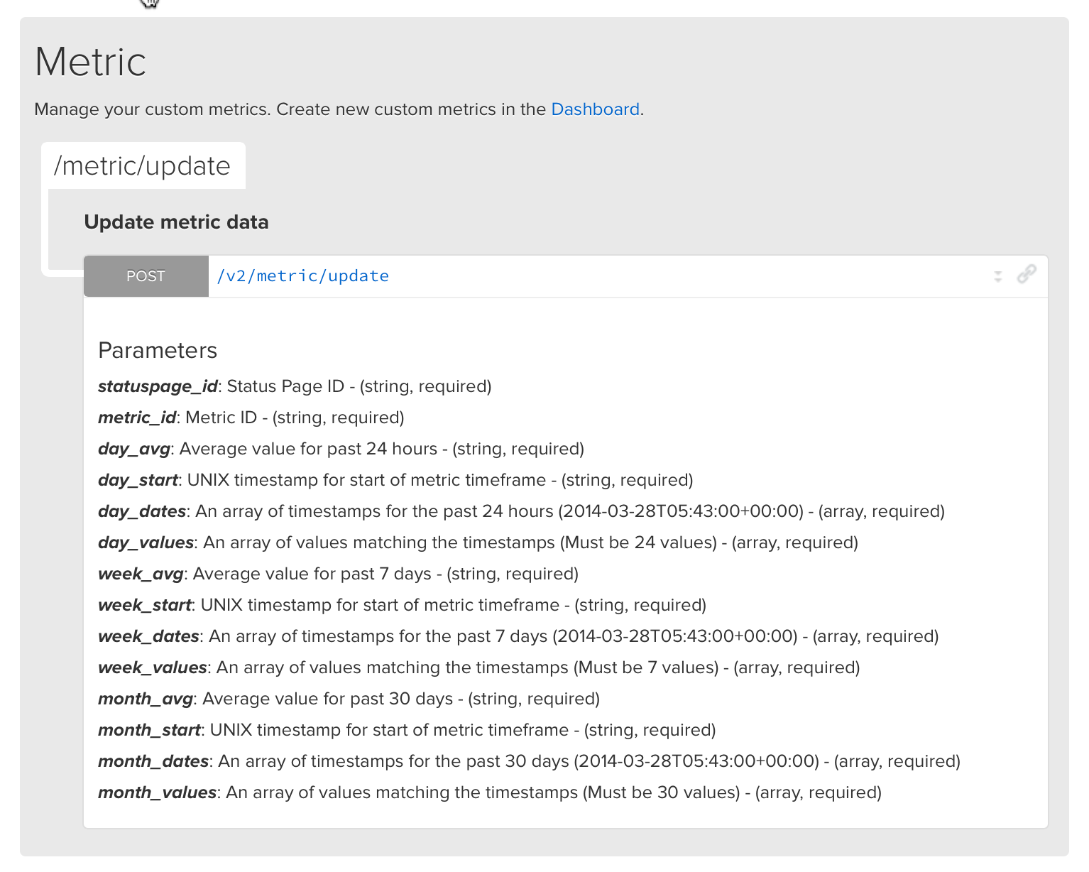
We baked a new feature into API v2… Custom metrics!
This is a great way to use any data source to power the metric charts on your status page.
Pipe in your data with just a single API call: /metric/update
Check out the full documentation here.
[Feature] Support for multiple New Relic accounts
[Feature] Ability to choose menu bar positions
[Improvement] Refactored webhook notification formatting
[Improvement] Switched to all green logo!
[Improvement] Increased thresholds for metric failure alerts
[Improvement] Added New Relic Browser module
[Improvement] Removed integrations view
[Bug] Fixed header image alignment
[Bug] Fixed team member quotas
[Bug] Fixed time pickers in maintenance modal
We released another minor UX option for your status pages.
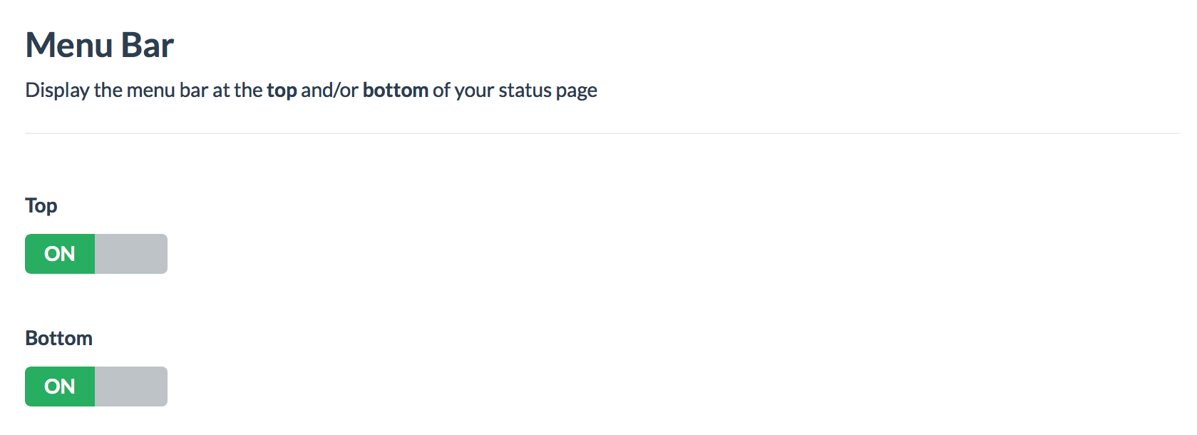
Now you can choose where to place the menu bar, either at the top, bottom or both sections of the status page.
The menu bar contains the buttons: subscribe, history, maintenance, report issue
You may still disable the report and subscribe buttons too.
Modify your menu bar’s placement in the Dashboard Design view.
Top example

Bottom example
