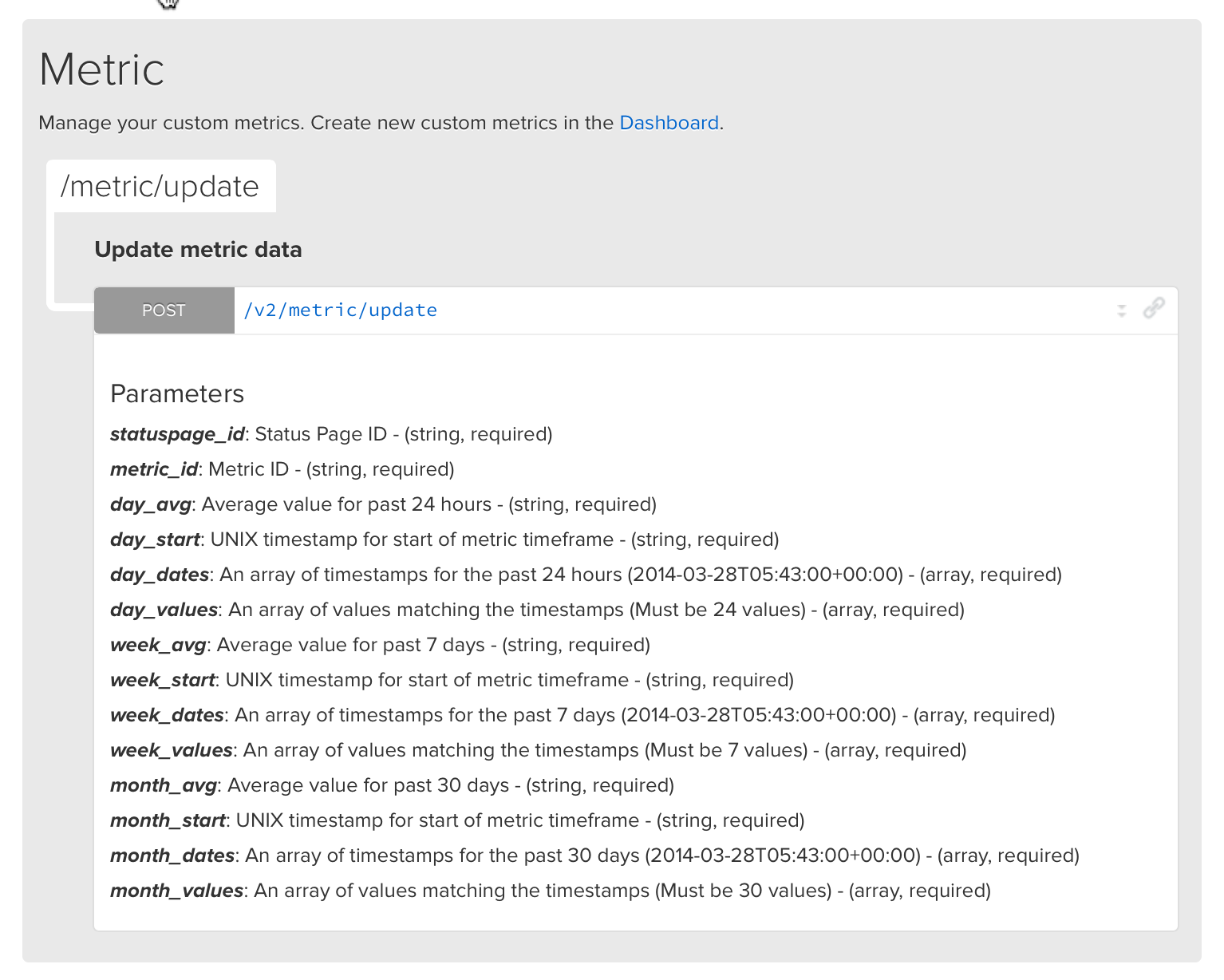
We baked a new feature into API v2… Custom metrics!
This is a great way to use any data source to power the metric charts on your status page.
Pipe in your data with just a single API call: /metric/update
Check out the full documentation here.
We baked a new feature into API v2… Custom metrics!
This is a great way to use any data source to power the metric charts on your status page.
Pipe in your data with just a single API call: /metric/update
Check out the full documentation here.
[Feature] Support for multiple New Relic accounts
[Feature] Ability to choose menu bar positions
[Improvement] Refactored webhook notification formatting
[Improvement] Switched to all green logo!
[Improvement] Increased thresholds for metric failure alerts
[Improvement] Added New Relic Browser module
[Improvement] Removed integrations view
[Bug] Fixed header image alignment
[Bug] Fixed team member quotas
[Bug] Fixed time pickers in maintenance modal
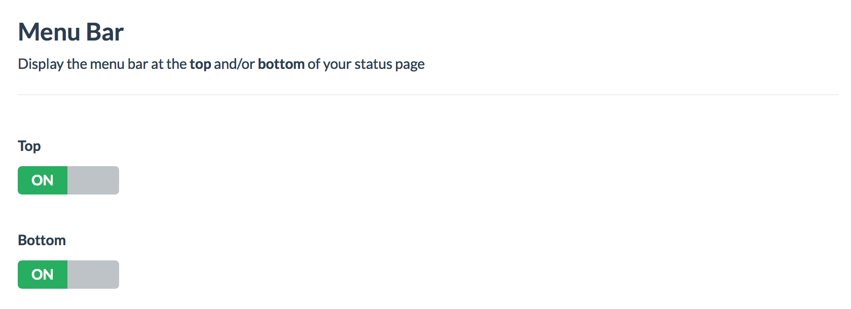
We released another minor UX option for your status pages.
Now you can choose where to place the menu bar, either at the top, bottom or both sections of the status page.
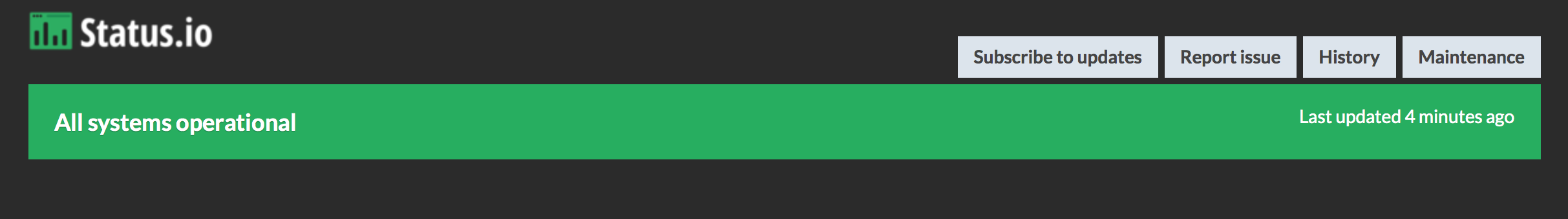
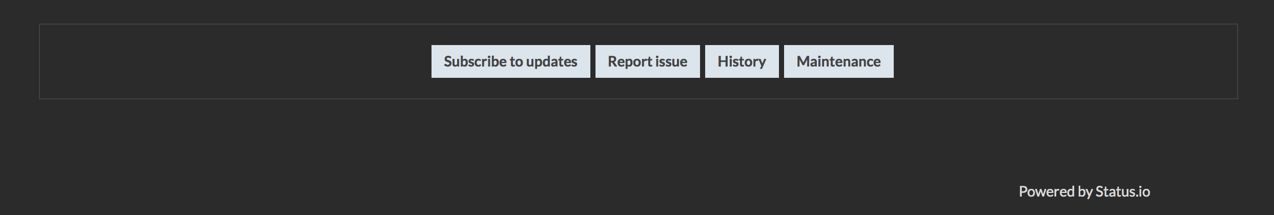
The menu bar contains the buttons: subscribe, history, maintenance, report issue
You may still disable the report and subscribe buttons too.
Modify your menu bar’s placement in the Dashboard Design view.
Top example
Bottom example
[Feature] Ability to customize status level colors
[Feature] Scheduled maintenance reminder notifications
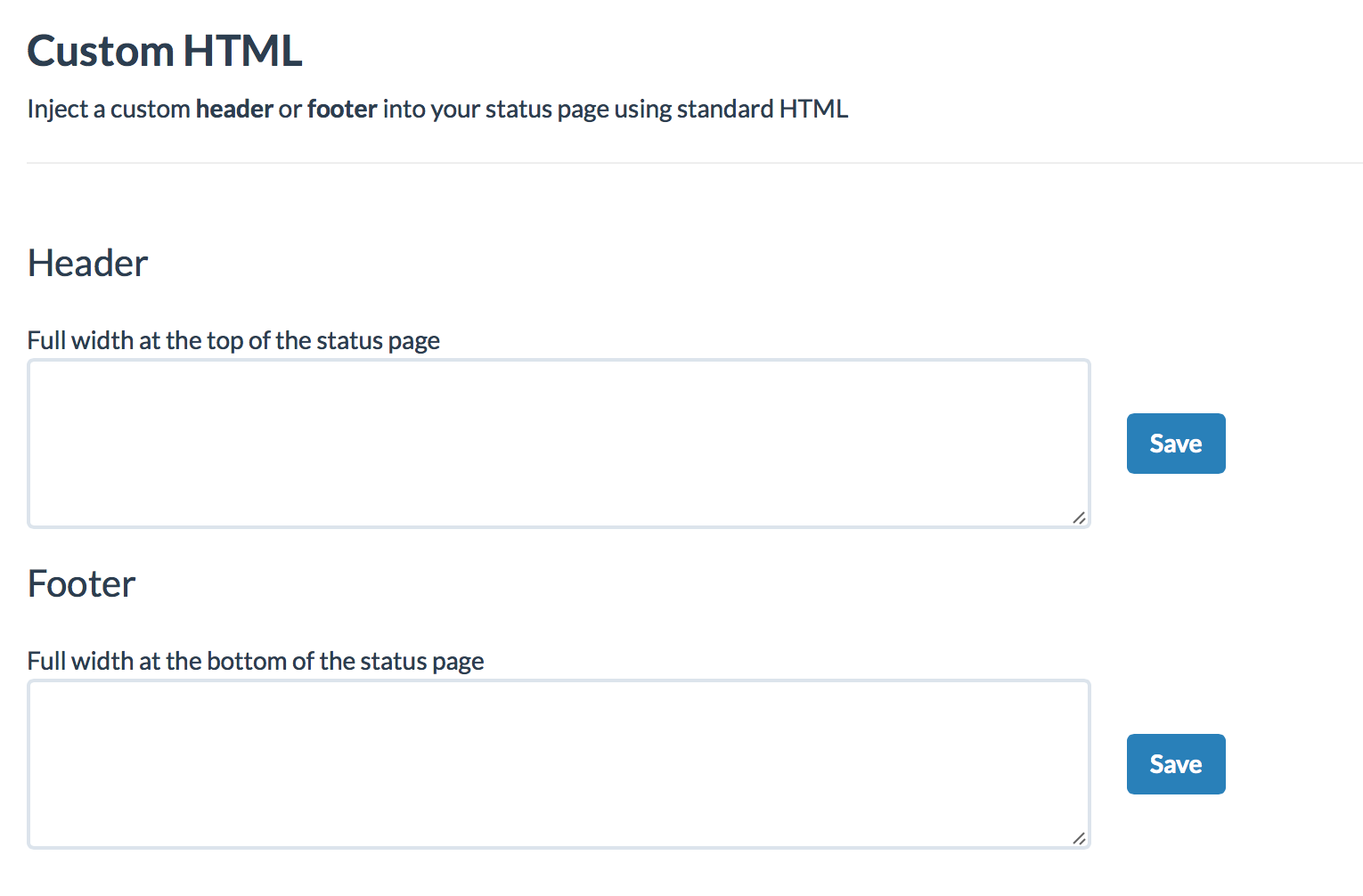
[Feature] Custom HTML header/footer
[Feature] Toggle component status directly from dashboard without creating an incident
[Improvement] Reschedule maintenance
[Improvement] Display dates for metric x-axis tick marks
[Improvement] Ability to disable subscribe button
[Bug] Fixed New Relic weekly metrics data to display proper intervals
[Bug] Chat functionality restored to dashboard design view
[Bug] Advanced colors now auto-save during input in dashboard design view
[Bug] Fixed issue where time pickers would not display in modals
Many customers have requested more design functionality. UX is going to be our top priority for the month of April — We have a whole slew of fantastic features planned…
In the mean time, we are rolling out some minor pieces of the design puzzle. Today we’re announcing official support for custom HTML.
Write your own code and it will be injected into the header and footer areas of your status page.
This is a great place to link back to your website, engineering blog, social media or pretty much whatever your heart desires.
Get started in the Dashboard Design view.
We’re always happy to help if you run into any issues or have a suggestion. Contact us anytime.